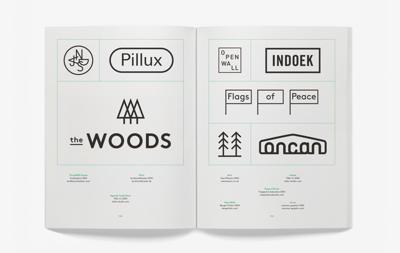
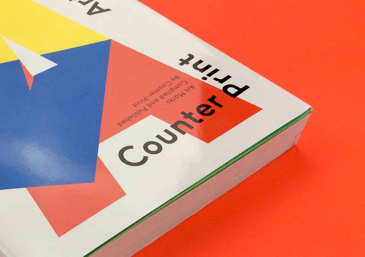
I thought I'd share some of the thoughts I had on undertaking our latest book, 'Art Marks'. In undertaking this title, we set out to compile
a wide-ranging survey of logos designed for the creative industries. ‘Art Marks’ contains over 300 logos designed for well-known museums, galleries and cultural centres, as well as for the architecture, design and fashion industries all over the world.
In the creative industries, it has become commonplace for institutions, companies
and individuals to create well-designed, coherent identities for themselves as a means
of conveying the essence of their brand or,
as with museums and art galleries, to also attract audience and funding.
Official statistics published by the UK Government reveal that the creative industries are now worth £71.4 billion per year to the UK economy and, despite a growing range of alternative activities, there also seems to be an increased appetite for the arts, with visitor numbers for institutions such as Tate Modern reaching all time highs. A reflection of this current level of interest can be seen in the abundance of identities designed for this sector, as displayed in 'Art Marks'.
Shifts in the practice of identity design
are also represented within ‘Art Marks’. The work displayed suggests a prevalence in contradictory styles, with some marks seemingly benefiting from technical proficiency, while others indicate a revival in the interest of older lettering styles and graphic techniques.
Sometimes the symbols shown are literal and naturalistic and it is clear at a glance what they stand for but in many cases such a solution is not possible and a more abstract design or combination of letters is chosen.
Recently, the design movement away from representationalism has led to the use of reductive lettering styles and shapes that have an iconography of their own. This provides
a new symbolism; one of ubiquity, modernity and efficiency.
The logo and our use of it is constantly evolving and developing a brand for a creative client has become a somewhat complicated affair. Many artistic institutions, in an attempt to convey their broad offer, are turning to ‘flexible’ identities, no longer consisting of
a static, single logo but a system that is able to change shape and react to ever-changing needs. This notion of adaptivity and flexibility seems to appeal particularly to the art world and the prevalence in these pages of challenging, creative approaches can be seen as crediting creative audiences with a large amount of visual intelligence.
Regardless of how we feel about the modern use of branding, it is fundamentally about identification. The logo can be seen
as the closest an organisation can come
to anthropomorphism. The logo is created in order to aid visual perception and is representative of personality. It provides
a face but also a visualisation of something more complex and many faceted.
'Art Marks' is a collection of the best known, most interesting and visually pleasing symbols which, in turn, express their institution’s ideology. Our hope is that it can provide a source of inspiration for those
who are about to decide on how they wish
to communicate their own ethos to the
outside world.
Jon Dowling
Counter-Print


Art Marks
Thanks so much!
Damian on
It’s F37 Ginger.
Jon Dowling on
Hello, does anyone know the typeface used for this book? Cheers
damian on